Intelligent, engaging design that works.

Whatever you need creating, 74º have all the angles covered.

A well designed website shouldn't just look great, it needs to be clear, concise and user-friendly too. 74º will ensure your site delivers your message, whether it's viewed on a mobile, tablet or a desktop browser.

Paper's not dead and an intelligently designed piece of print can still get you noticed. 74º will communicate your message clearly whether it's a brochure, a leaflet or even large format displays.

Designing a successful User Interface for a hand held device ensures users will continue to use your app long after they've downloaded it. 74º can create engaging UIs that are intuitive and easy to navigate.

Brand Identity | Brand Implementation | Web Design

UX Design | Web Design
Brand Identity | Brand Implemetation
Brand Identity | Brand Implementation | Web Design
Brand Identity | UX Design | Web Design
UX Design | Web Design
UX Design | Web Design

UX Design | UI Design | Brand Identity
UX Design | UI Design
UX Design | UI Design
UX Design | UI Design

Graphic Design

Ian is a designer with over 20 years experience working in many disciplines including brand identity, UX & UI design, brochures, exhibitions, catalogues and advertising.
I'm available for freelance work, so get in touch and let's see what I can create for you.
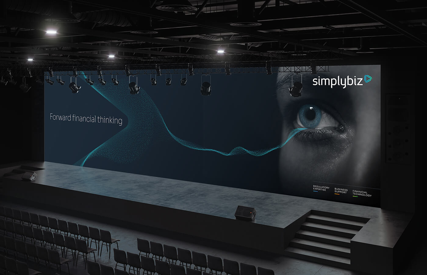
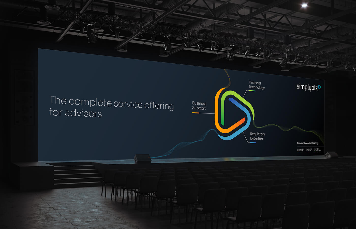
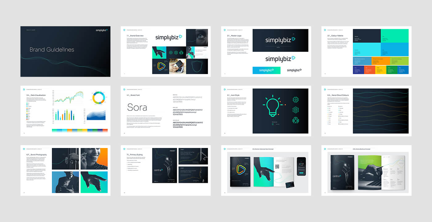
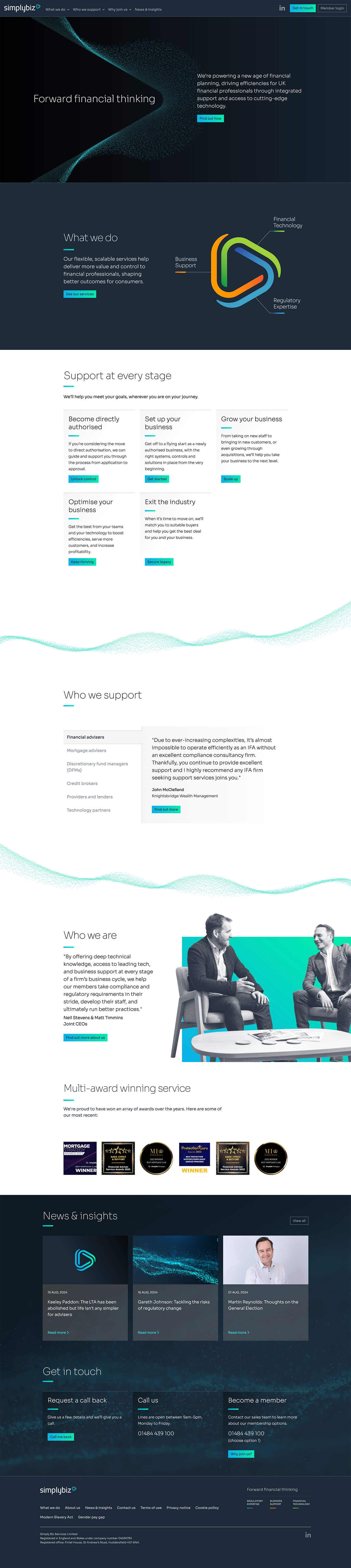
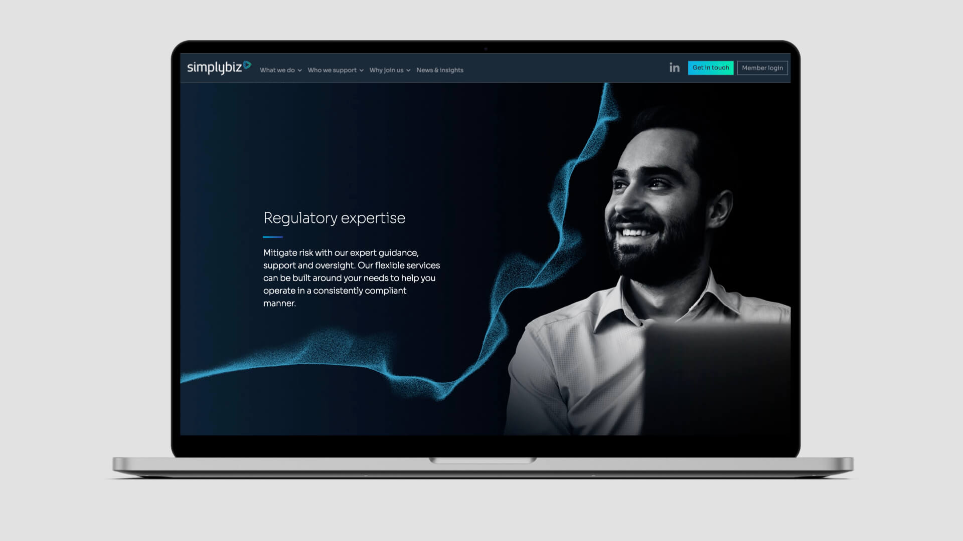
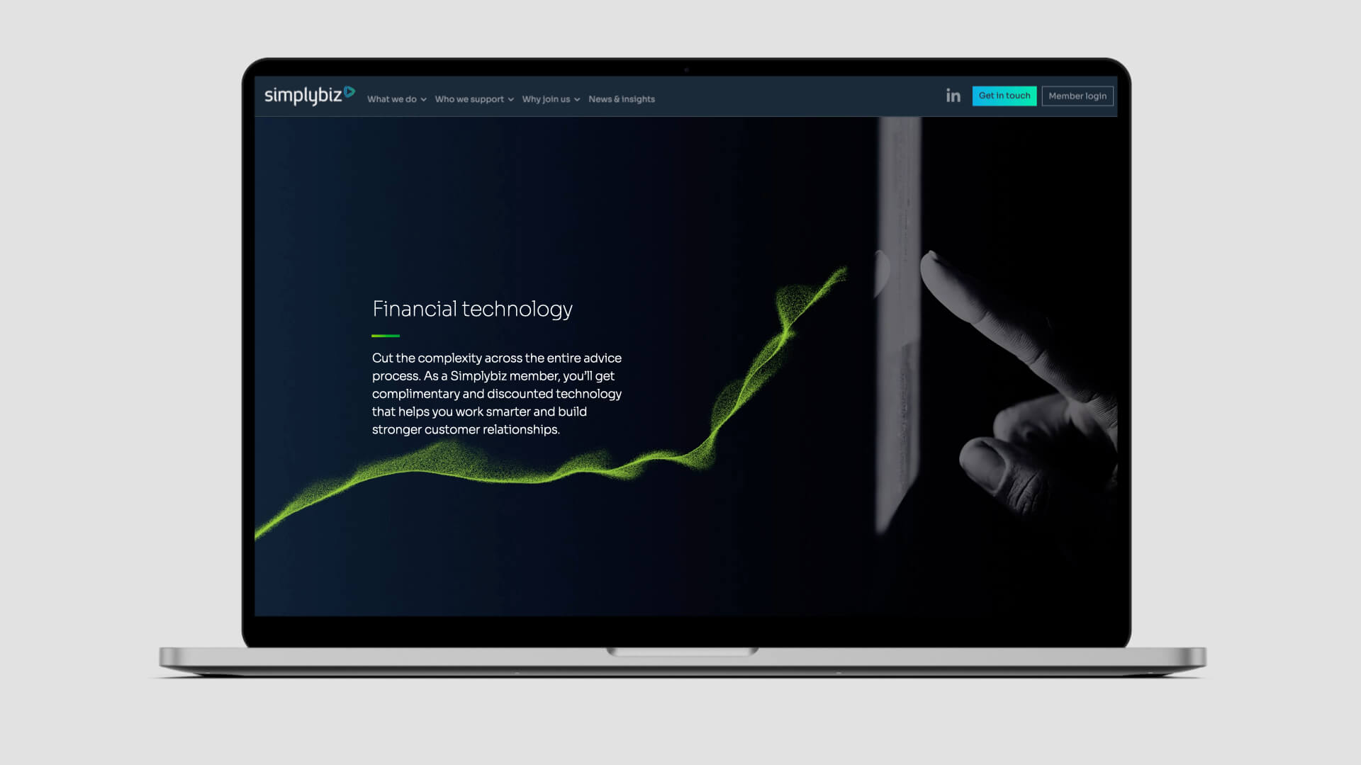
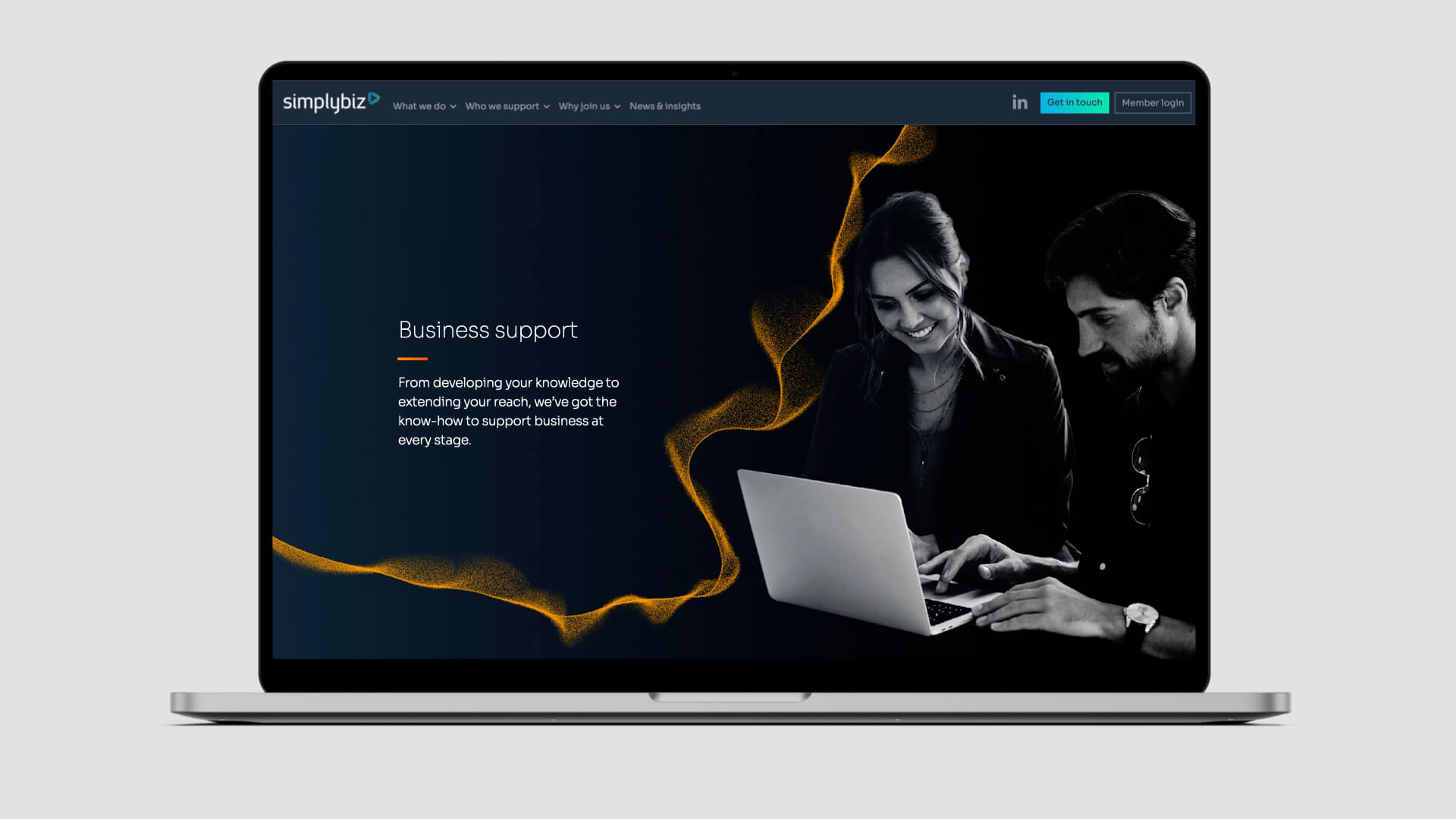
The brief called for a brand realignment that showcased Simplybiz’s shift toward a tech-focused future while preserving the personal touch it’s famous for.
The redesigned brand mark captures Simplybiz’s evolution as a fintech-driven service provider. At its core is a forward-moving arrow symbolizing momentum and rapid innovation. Composed of three interconnected elements, it visually represents Simplybiz’s pivotal role in Retail Financial Services—linking product providers, advisers, and consumers.
Key brand assets include the striking and versatile “nano-cloud”—a dynamic graphic device made of vibrant, dancing particles. These particles, seemingly chaotic, can coalesce to form shapes and graphics, creating a powerful metaphor for Simplybiz’s ability to transform fragmented market elements into cohesive, effective solutions. Whether used standalone, blended with photography, or animated, the nano-cloud is a showstopper.
A fresh, contemporary color palette and clean typography round out the rebrand, delivering a bold, tech-forward identity. This reinvention has not only elevated SimplyBiz’s perception within the industry but solidified its standing as a modern, innovative leader.
view website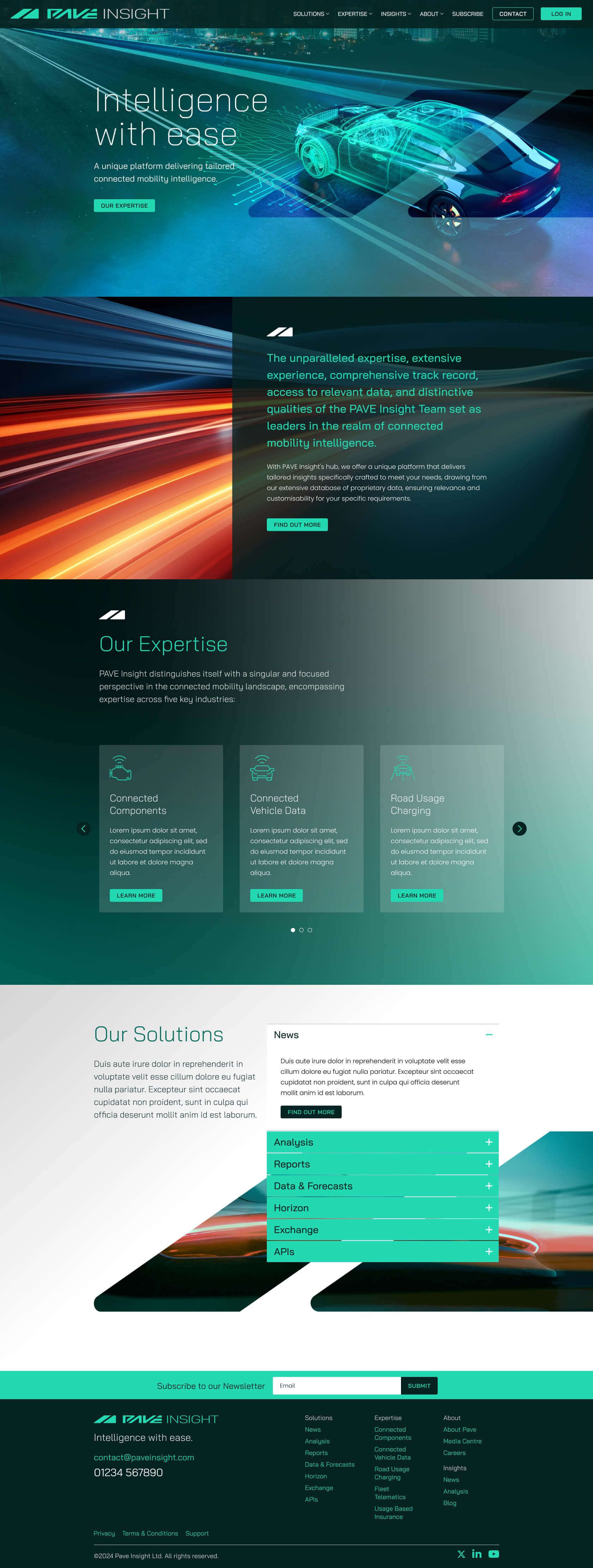
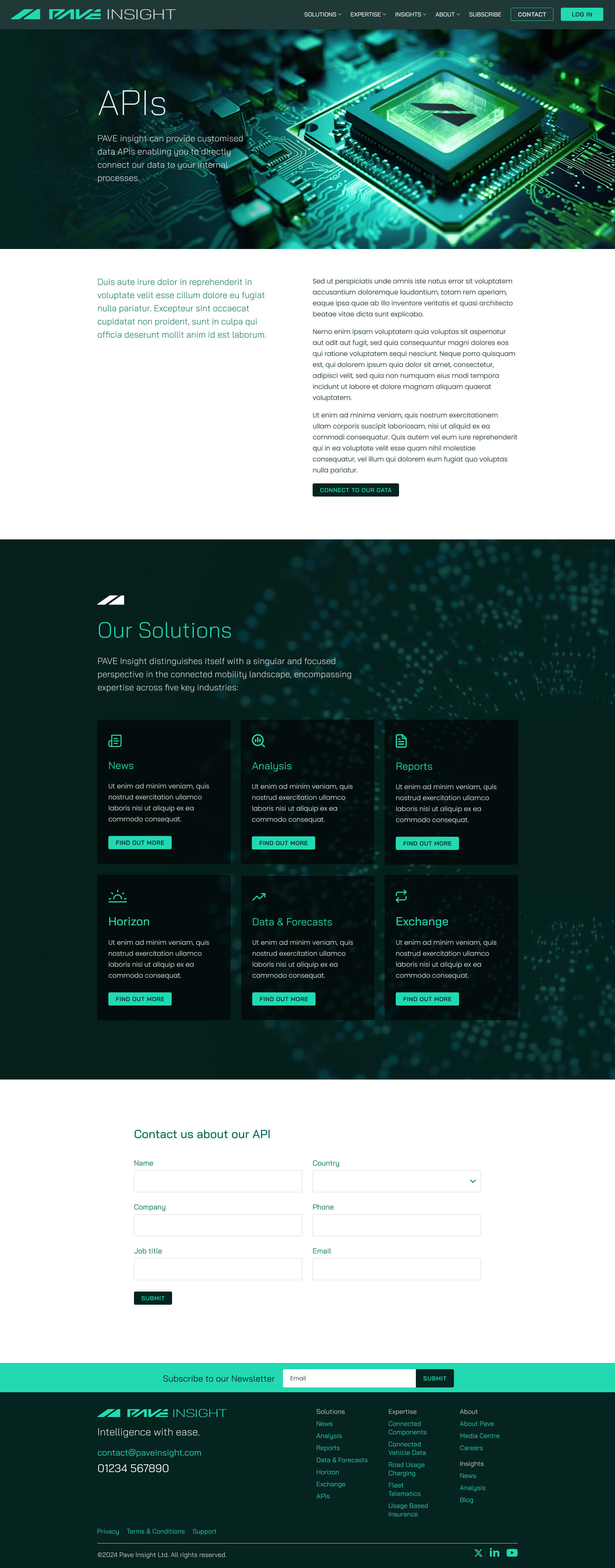
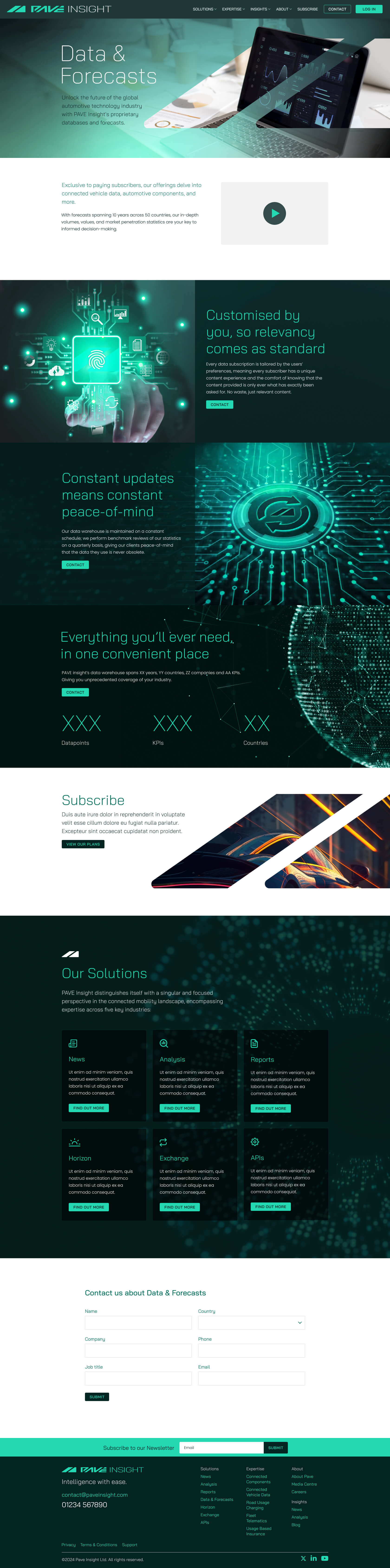
It was exciting to get the opportunity to design the website for a tech start-up working in the connected vehicle data market.
Simplicity was a key factor when designing the structure of the site and creating low fidelity prototypes helped the client focus on what was most important for their user experience.
It was an enticing prospect to develop the brand and create an online presence that visually reflected PAVE Insight’s bold ambitions.
Connectivity is at the core of PAVE’s ethos and to illustrate this abstract tech-focused images were created that conveyed speed and interconnection. These were integrated with the brand icon and a simple yet distinctive colour palette to create a visually striking design language.
view website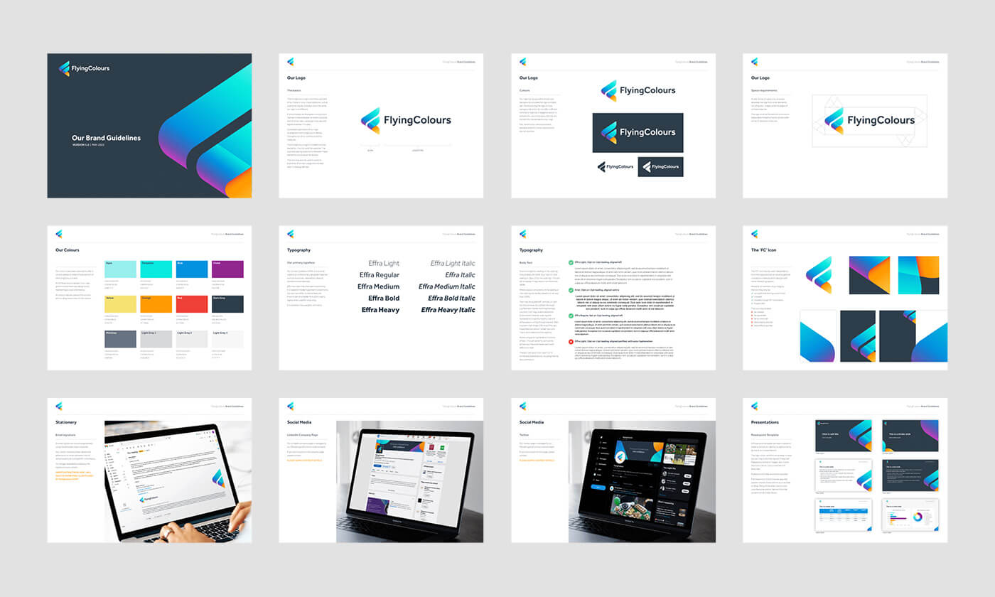
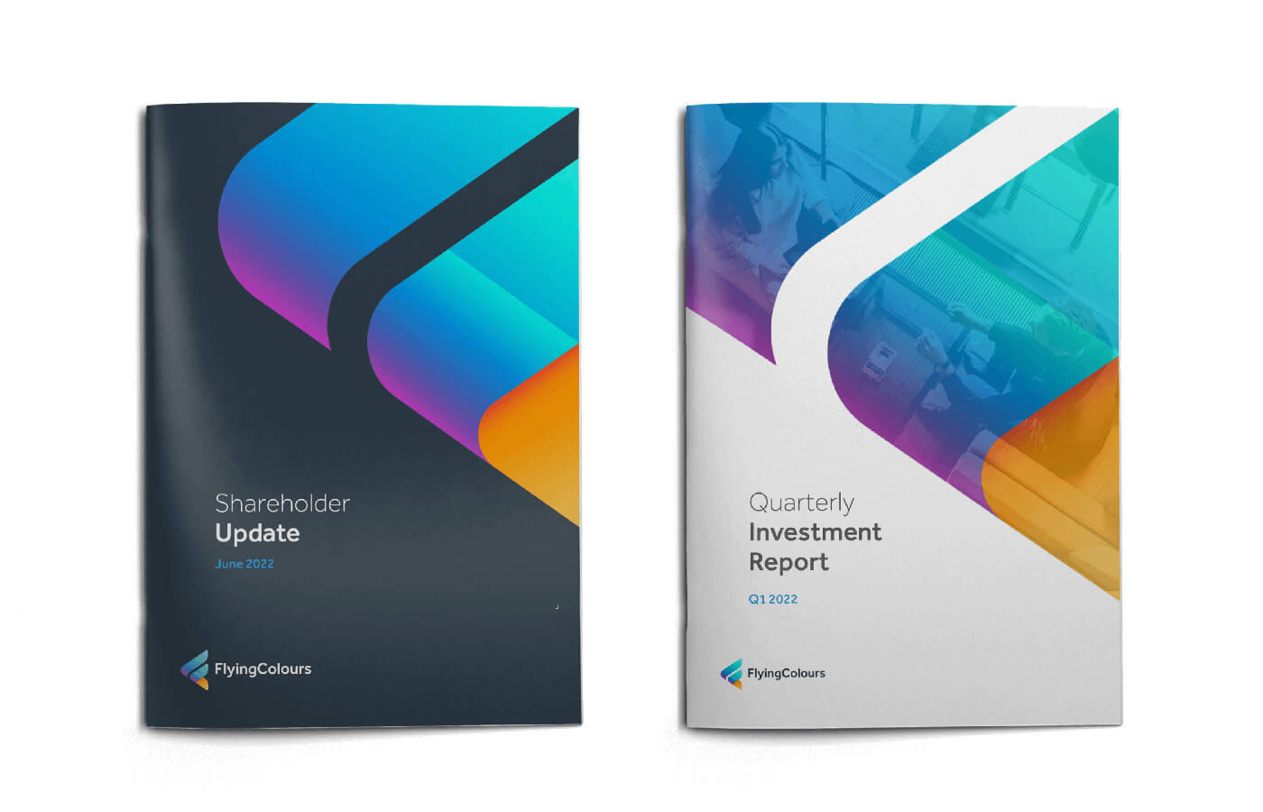
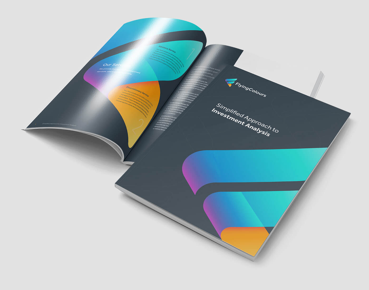
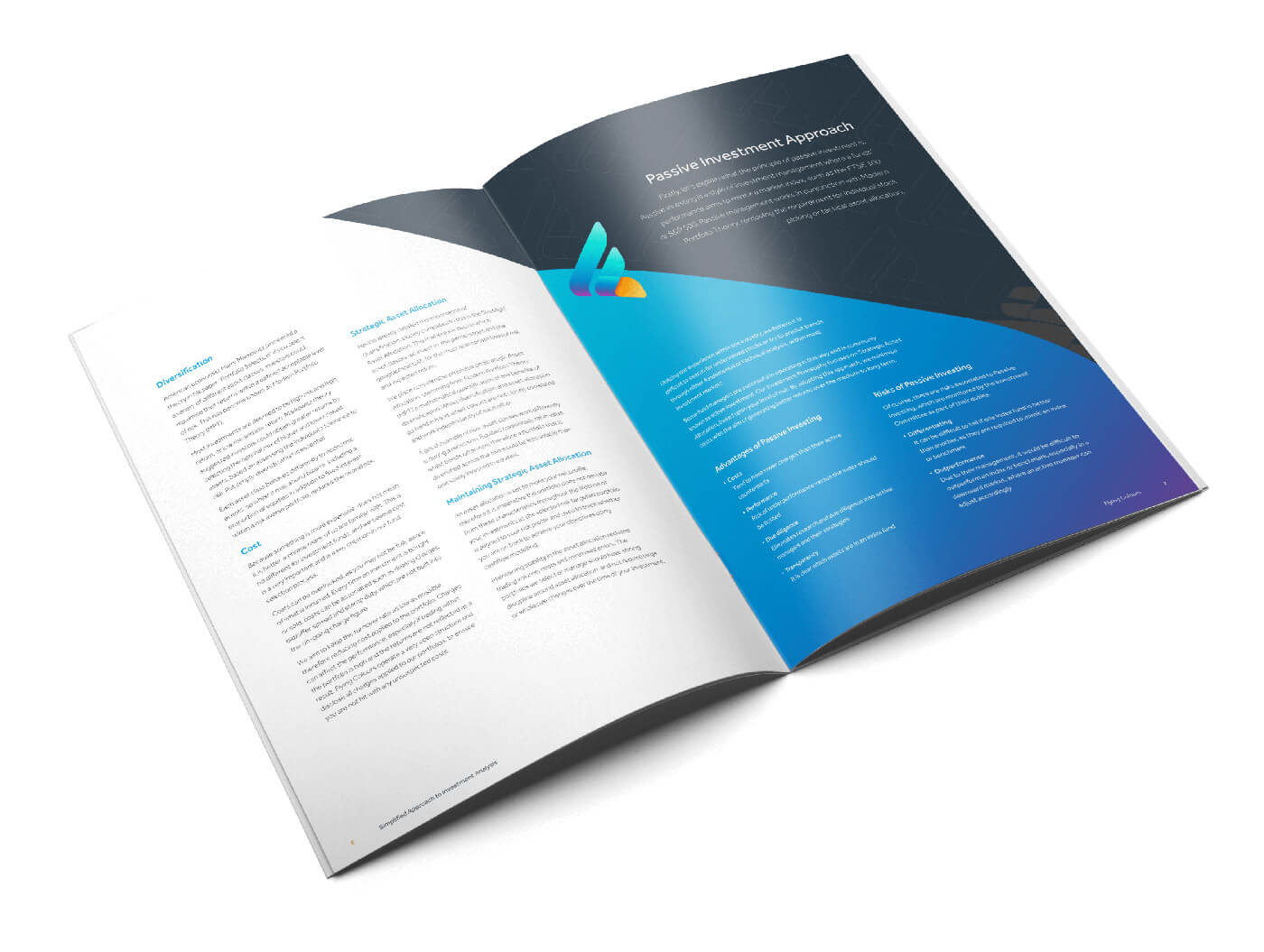
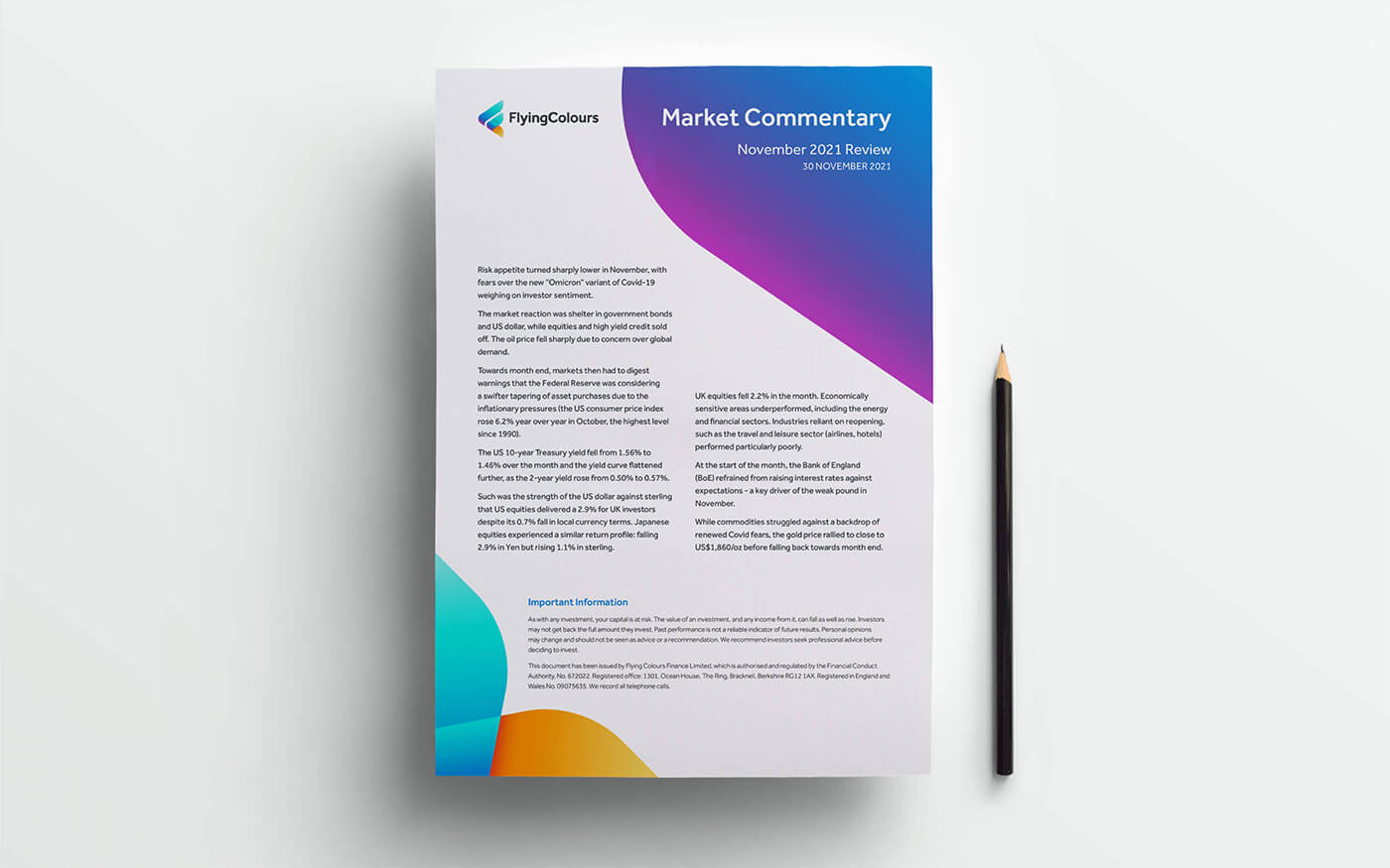
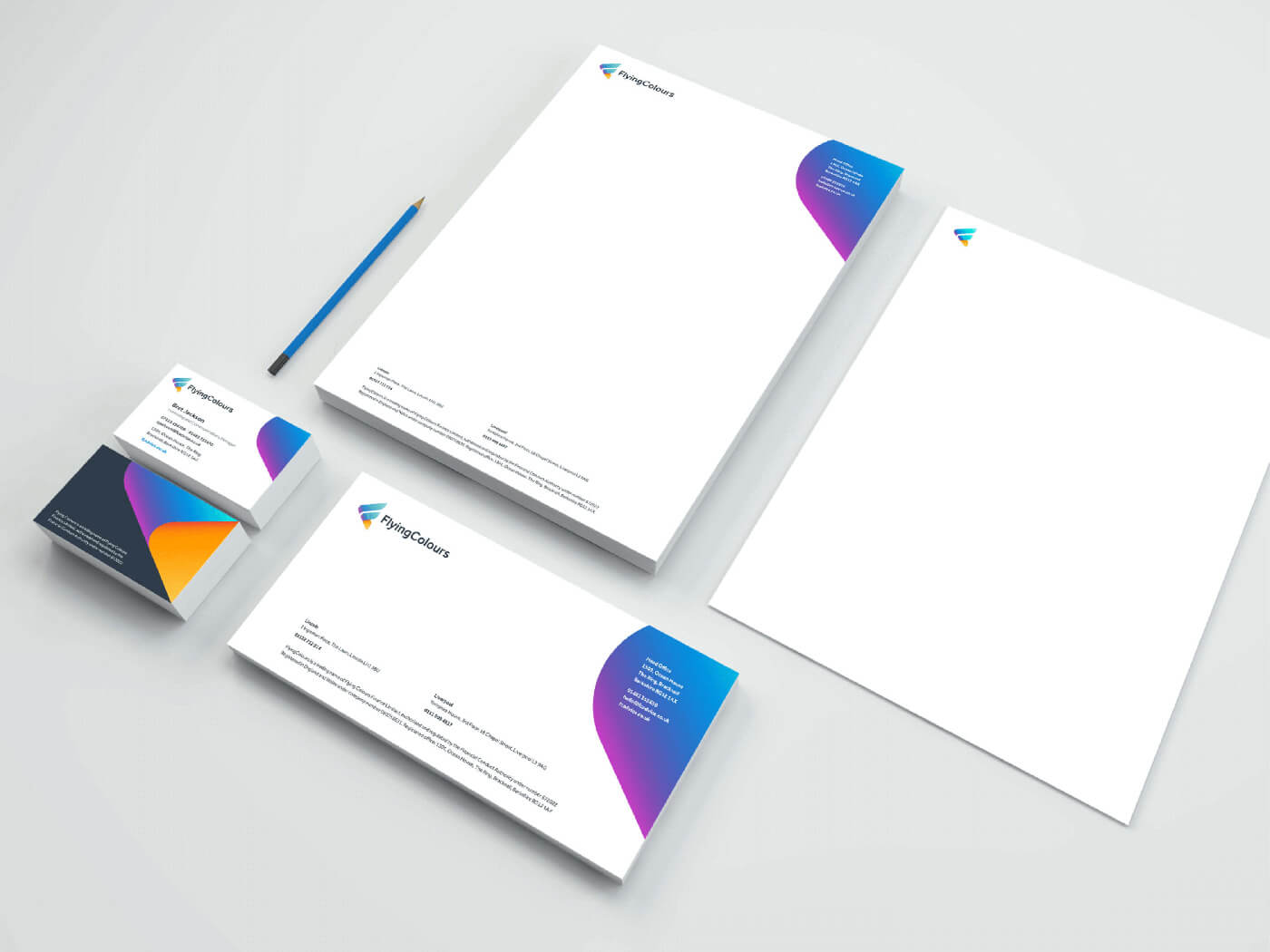
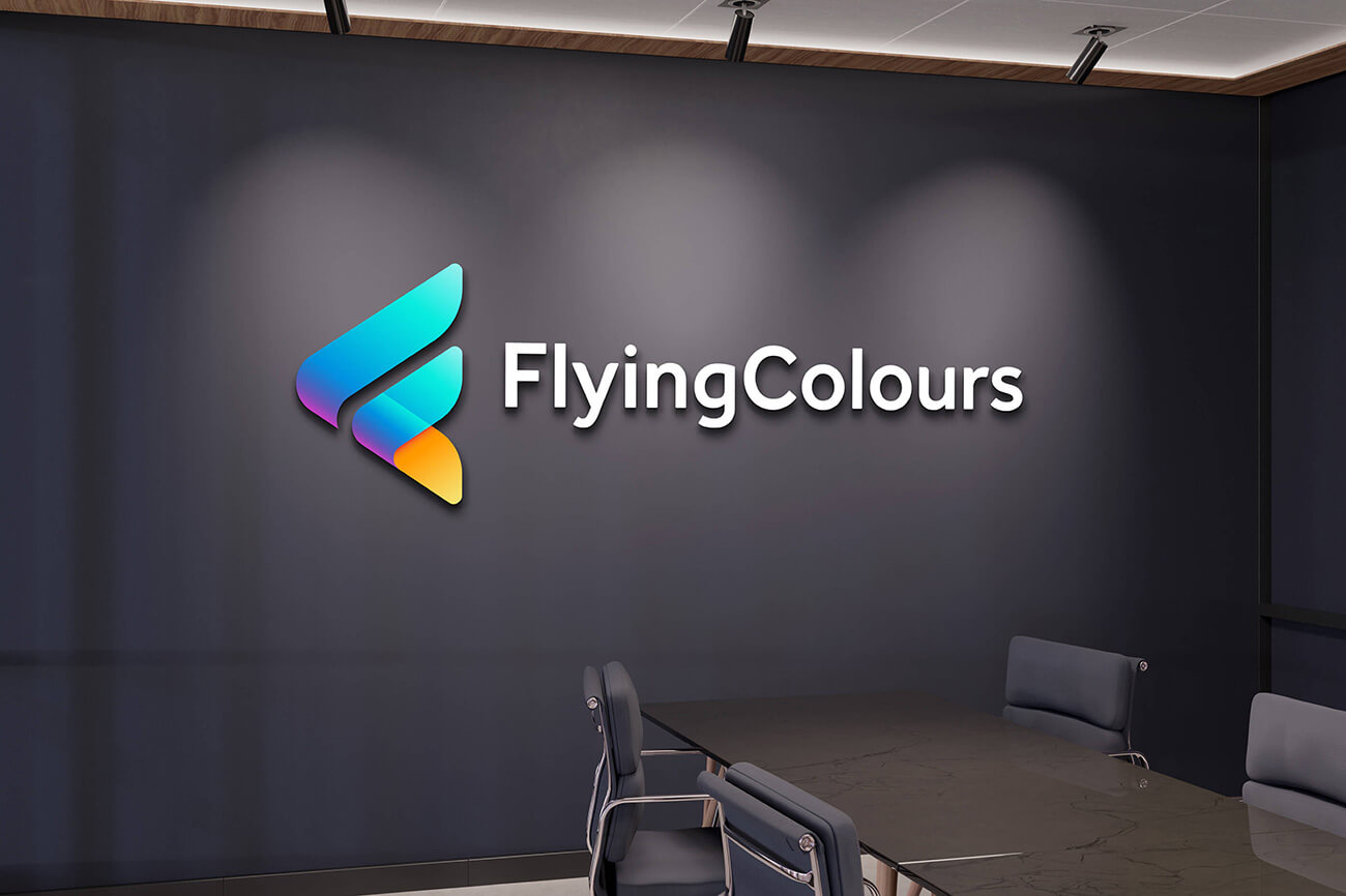
To position Flying Colours as a leading force in the financial advice sector, a vibrant and adaptable brand identity was created. The design incorporates the company initials to form an arrowhead, representing movement and energy, while drawing inspiration from a wing’s shape to symbolise upward progress and reflect the 'Flying' in Flying Colours.
The new brand focuses on a simplified, modern colour palette that is both versatile and easy to implement. Comprehensive brand guidelines ensured streamlined, FCA-compliant communications while establishing a cohesive and instantly recognisable visual identity.
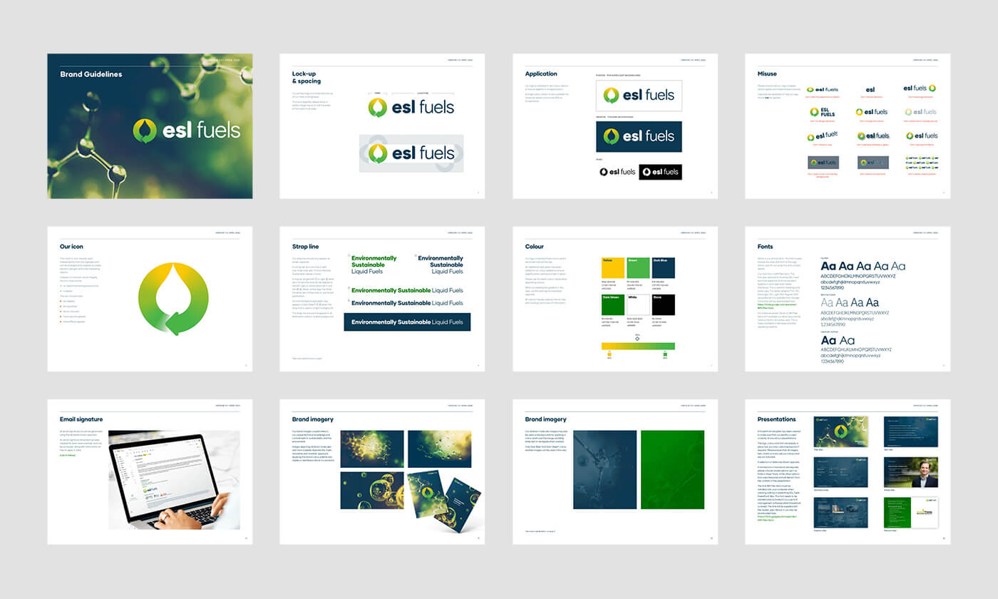
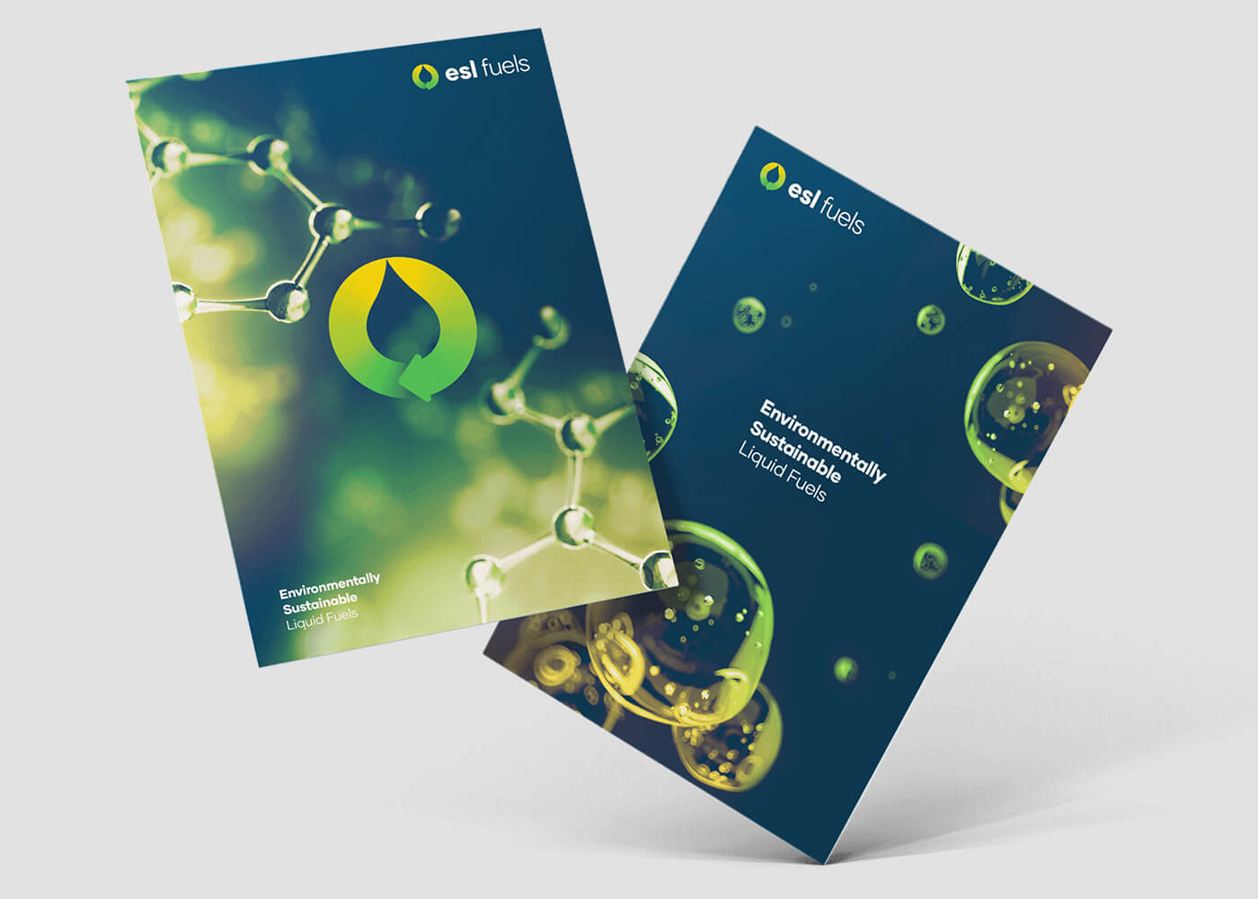

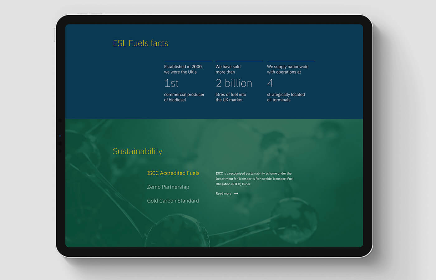
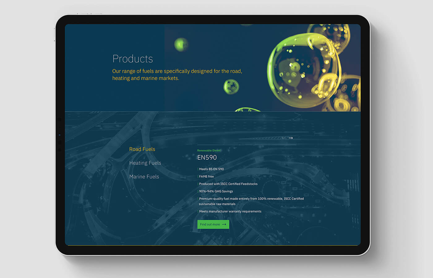
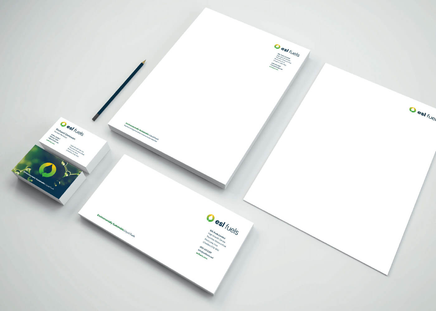
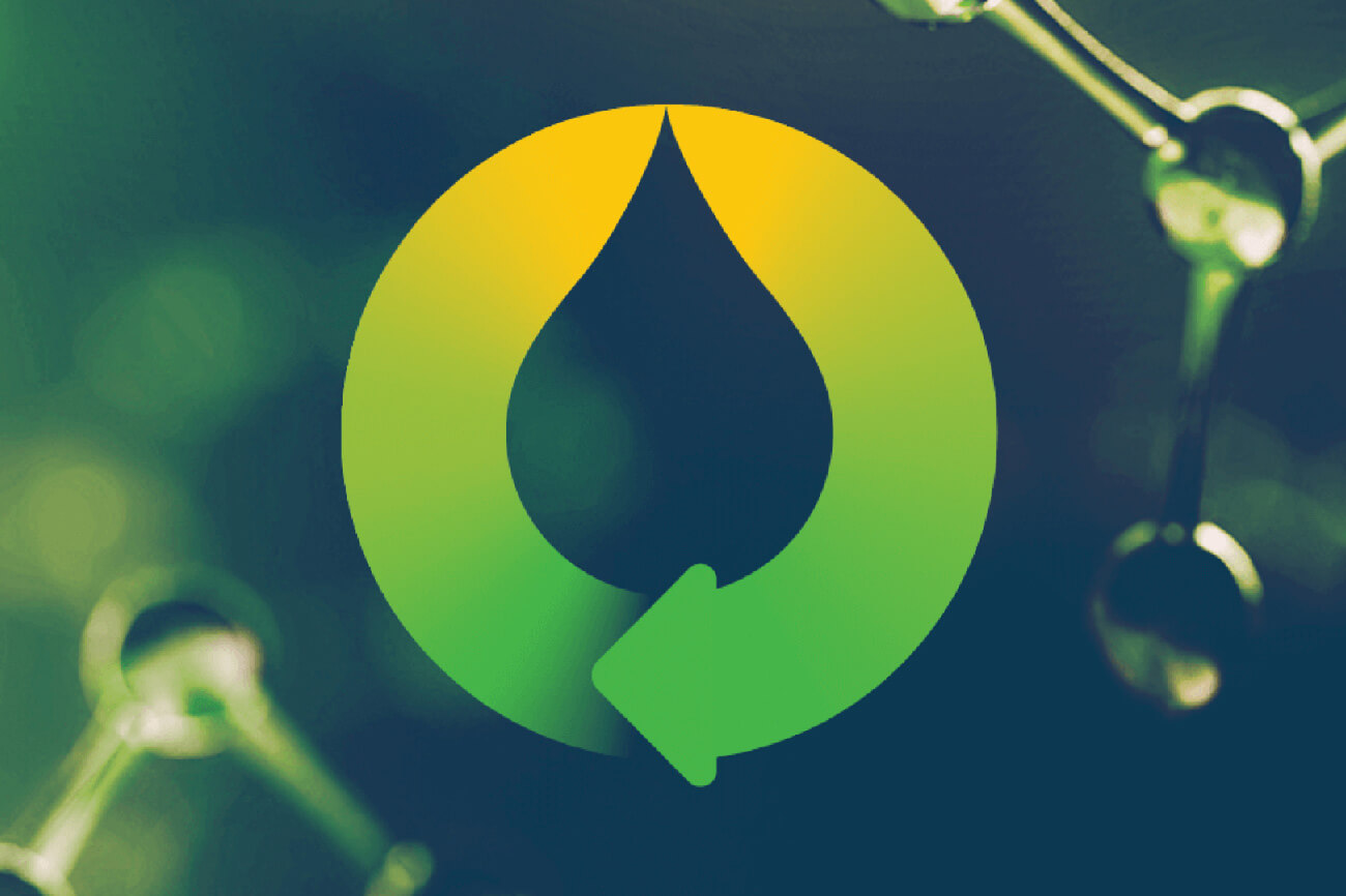
For this new brand identity, the goal was to design a symbol that clearly and simply conveys the essence of ESL Fuels’ work - creating innovative liquid fuel products for the heating, road and marine markets.
To visually articulate ESL Fuels’ position as the liquid fuels market leader in technical innovation, a scientifically themed brand was created that instantly portrays ESL Fuels’ technical expertise and commitment to creating bespoke liquid fuels, within an environmental, sustainable and ethical framework.
view website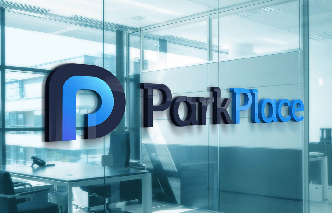
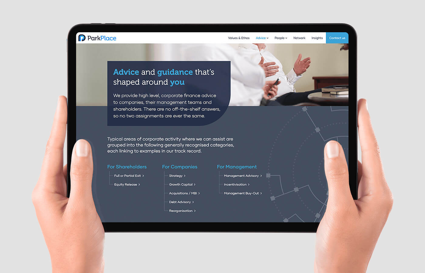
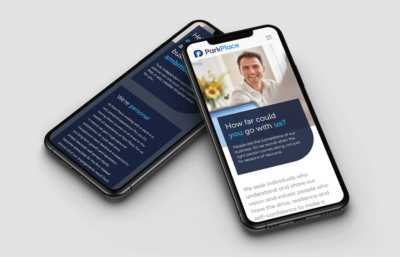
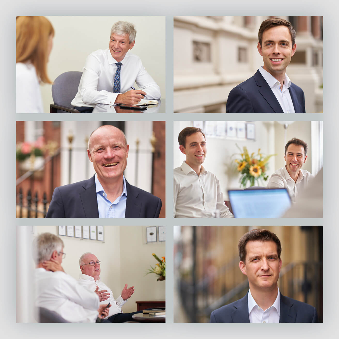
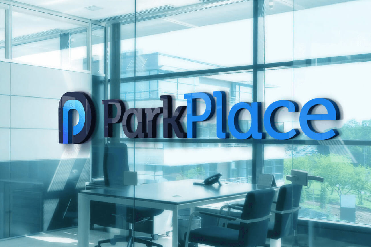
It’s the personalities of the individuals at Park Place that drive the strong relationships with their clients – a perspective welcomed by the partners who were keen to share the spotlight with the entire team.
To showcase this, a photo and video shoot was art directed to capture the true charisma of this small but genuinely convivial team.
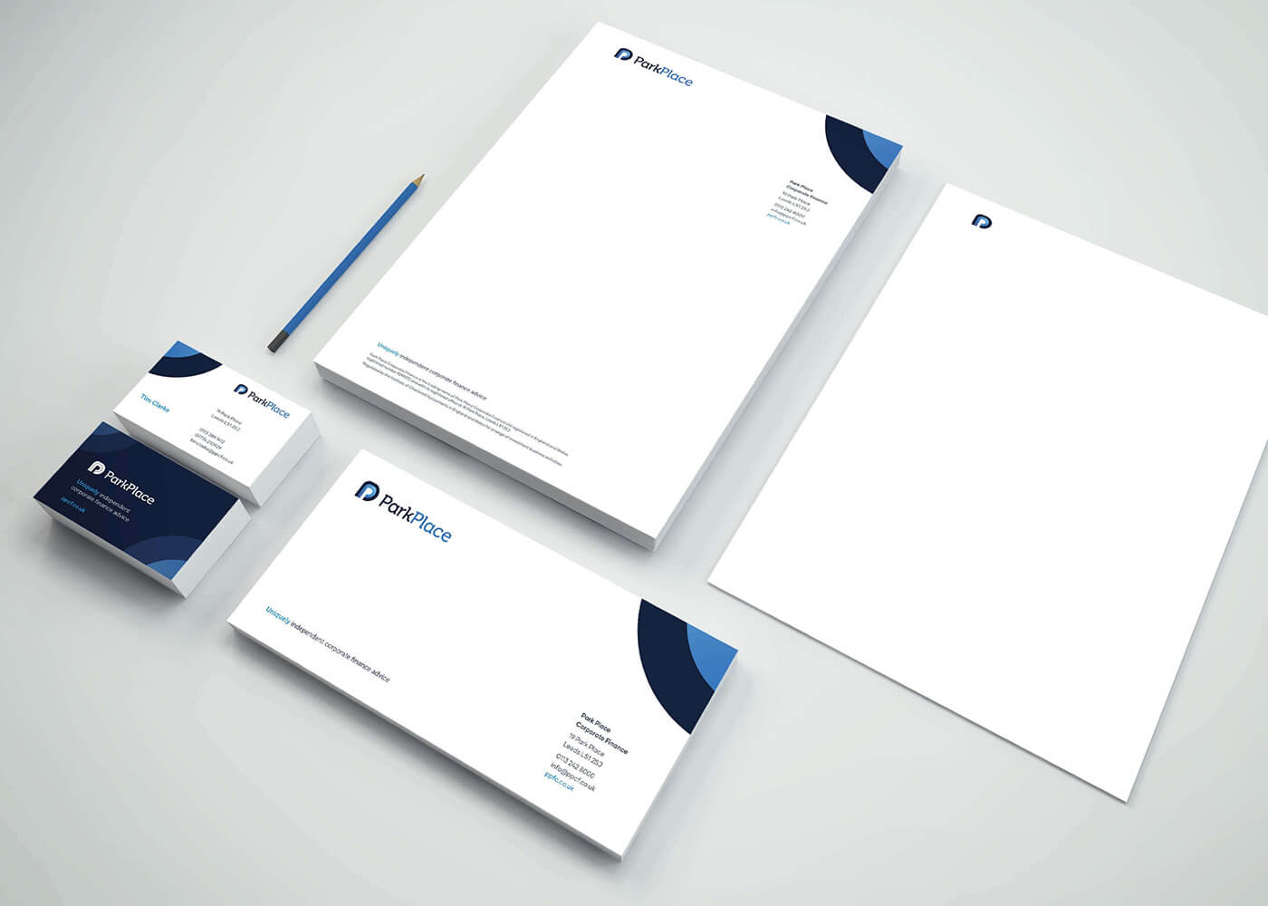
Taking cues from the re-designed logo and by using a single rounded corner in the main message panels, we’ve created a simple, professional visual language that accurately reflects Park Place’s personality as a dynamic, approachable organisation.
view website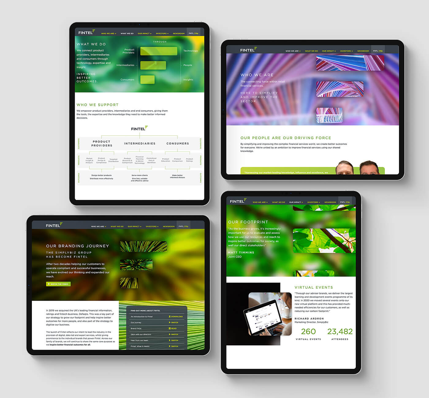
Rebranding from SimplyBiz Group to Fintel wasn’t just a name change—it marked a bold shift in how the organisation drives efficiency in financial services.
This transformation needed an equally dynamic online presence. The result? A cutting-edge website that positions Fintel as a trailblazing fintech leader in the era of data-driven, digital solutions. With custom videos, animations, and a vibrant design, the site breaks away from the often-stuffy financial services mold, setting Fintel apart as innovative and forward-thinking.
And the impact wasn’t just visual—it was financial. The group’s share price saw an immediate boost post-launch, proving once again that strategic, standout design delivers real-world value.
view website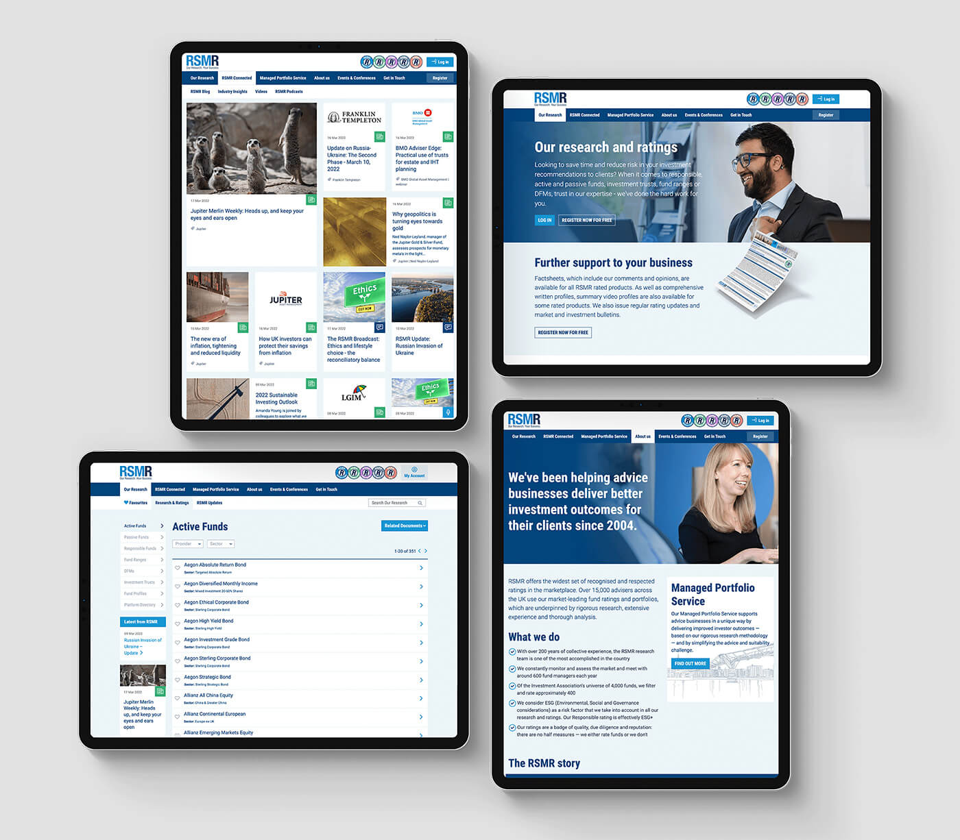
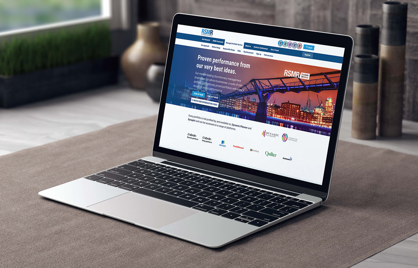
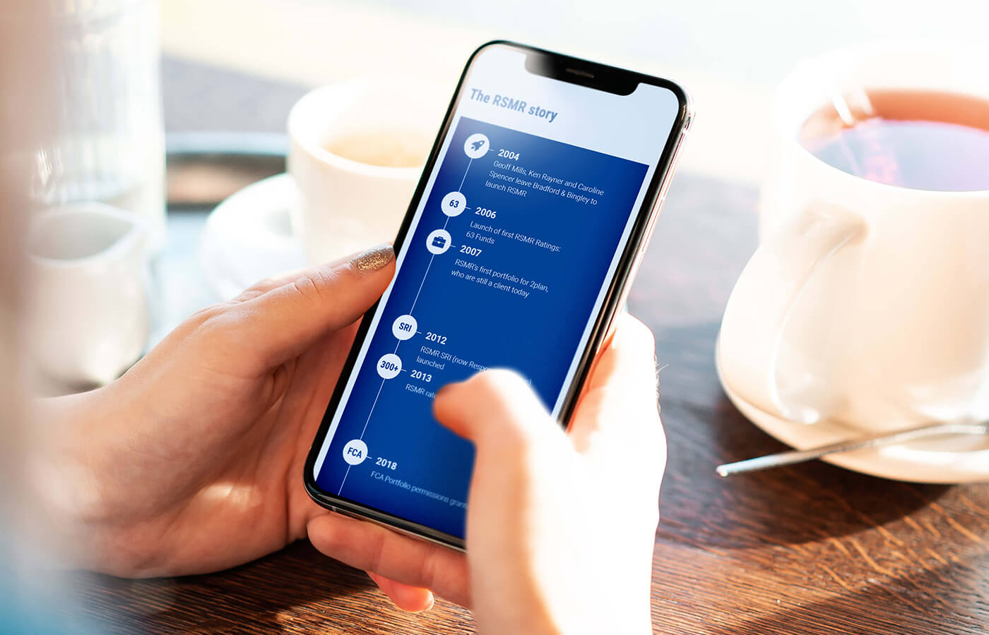
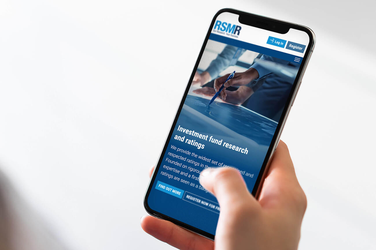
As leaders in fund research, it wasn’t hard to convince RSMR of the value of a comprehensive competitor analysis. This identified key UX conventions relevant to their industry and addressed specific challenges.
Analysing user behaviour determined the most critical pages, enabling a clear and effective content hierarchy. This process streamlined the website into a user-focused structure, making it easier for visitors to access the information most important to them.
RSMR also have an extensive annual events programme which includes, conferences and online webinars. This separate events website was incorporated into the new structure, offering users a more cohesive experience.
view website
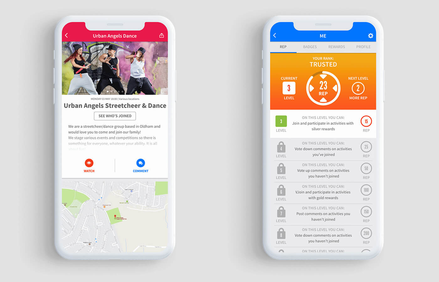
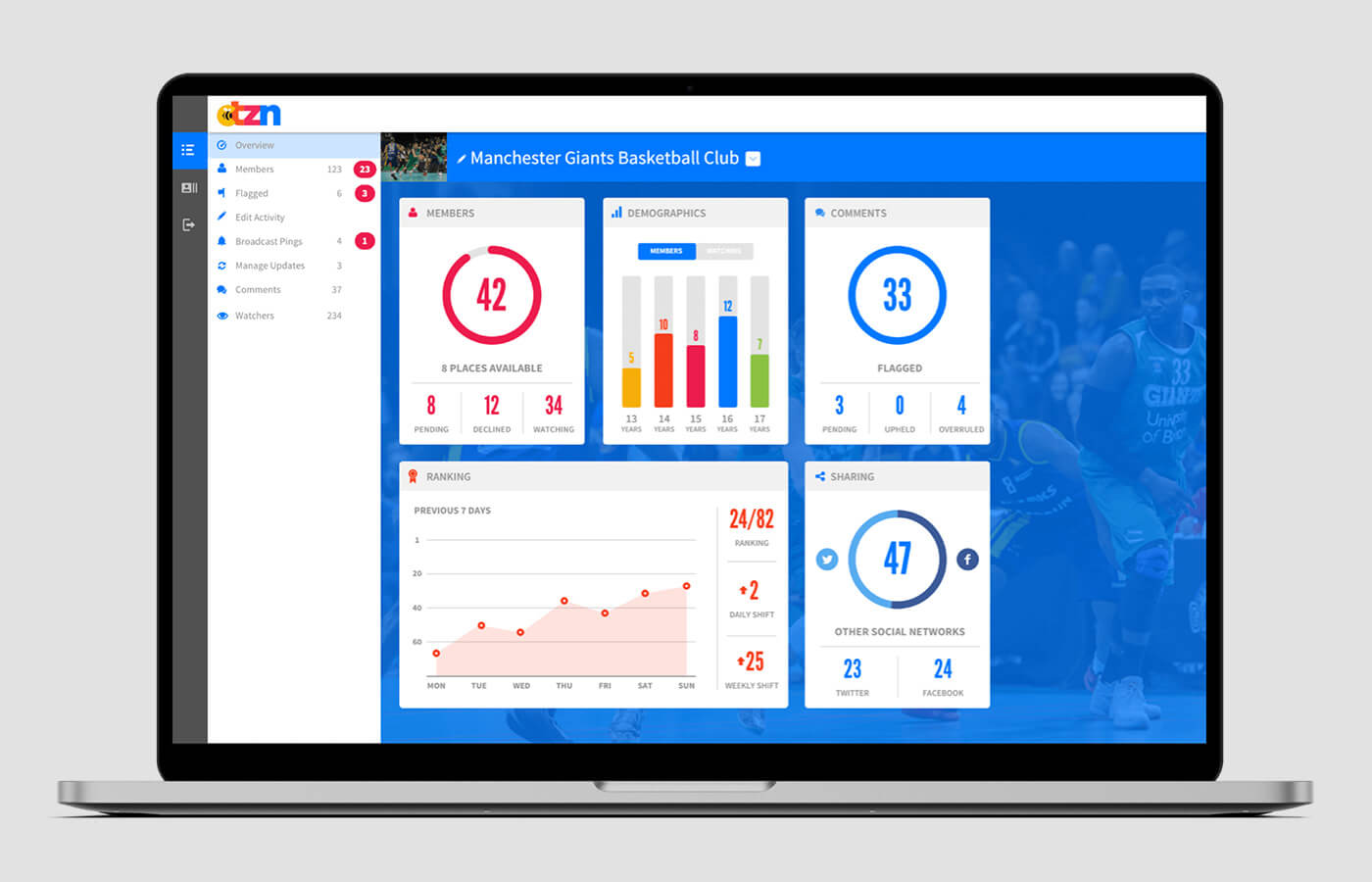
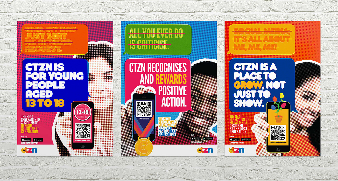
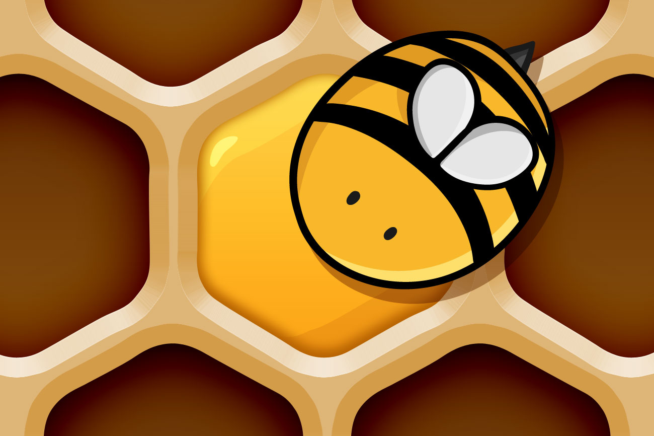
Asking teen-aged focus groups carefully crafted questions to gained real insight into their social media usage. This informed of where prospective audiences felt the platforms they used were lacking and were able to design a new platform to fill in the blanks. The result was a carefully crafted mobile user experience, designed with the help of young people, for an audience of their peers.

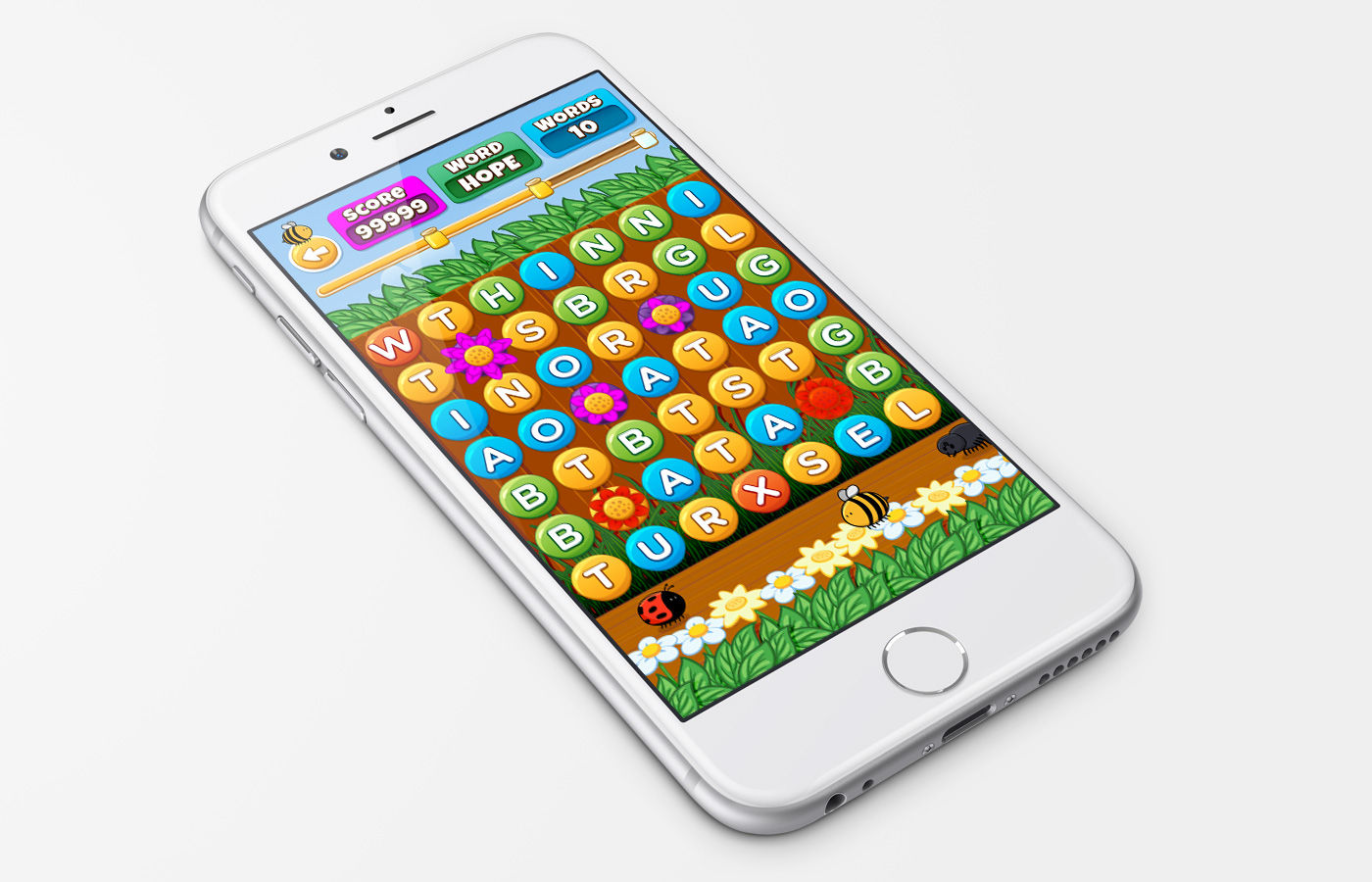

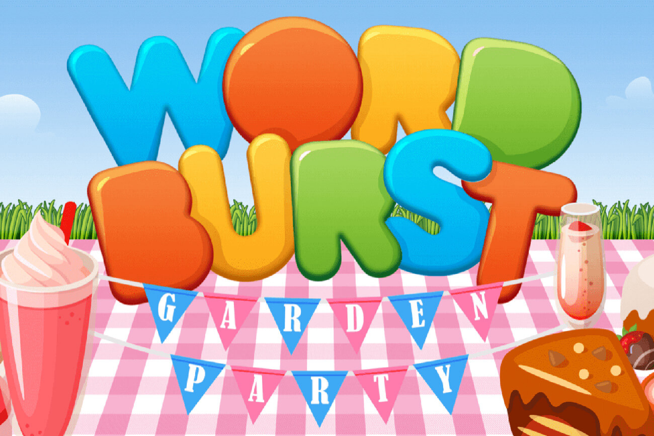
Search, swipe and explode your way into this word game with a diverse selection of game types to suit everyone!
Creating the visual back-story and designing this User Interface for WordBuzz was just as much fun as playing this addictive word game.


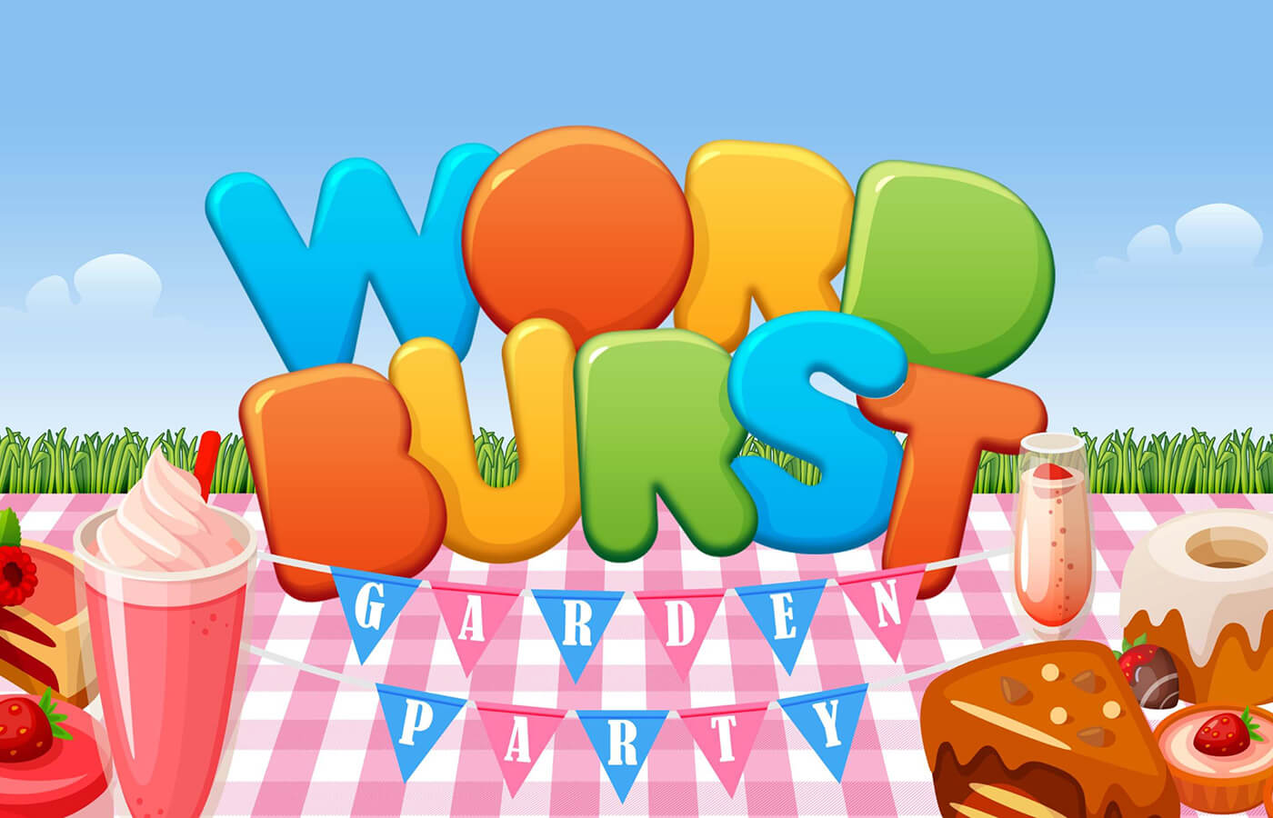
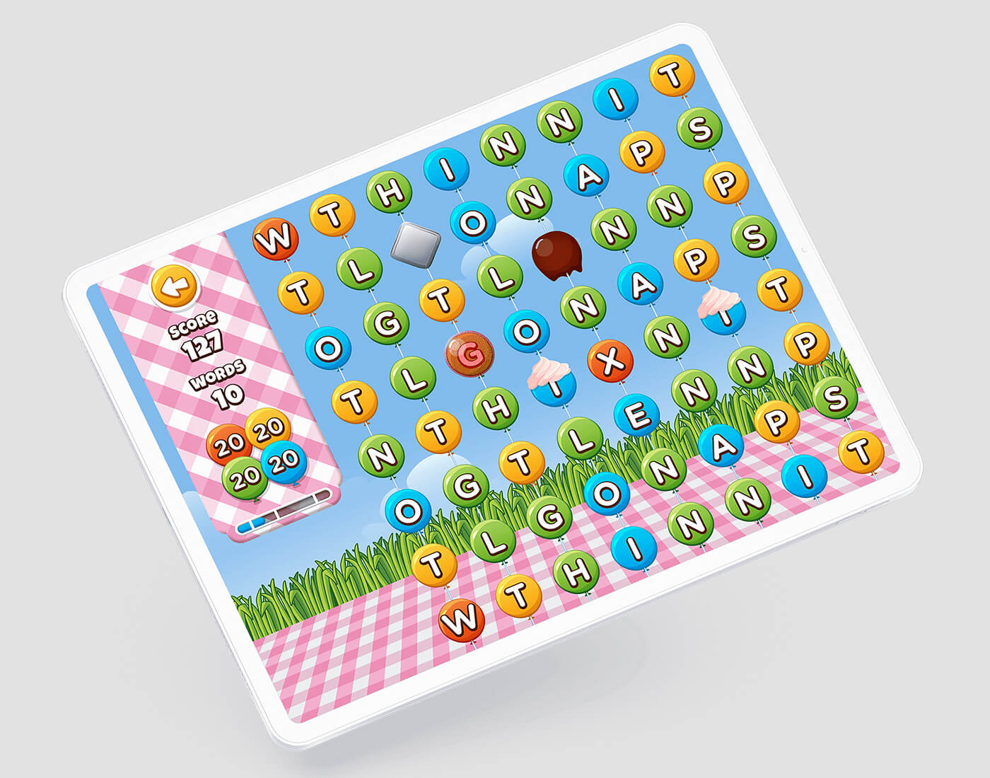
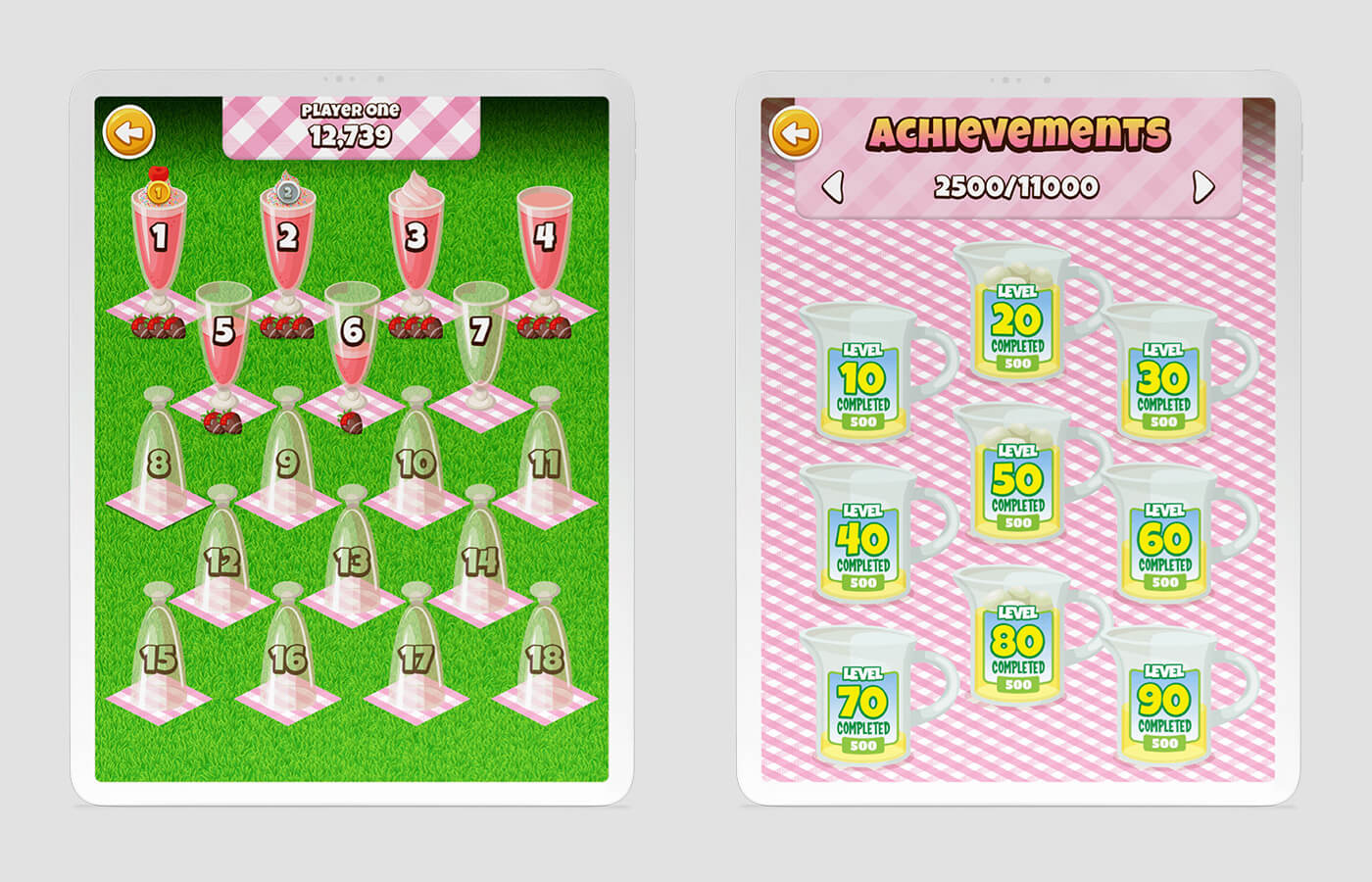
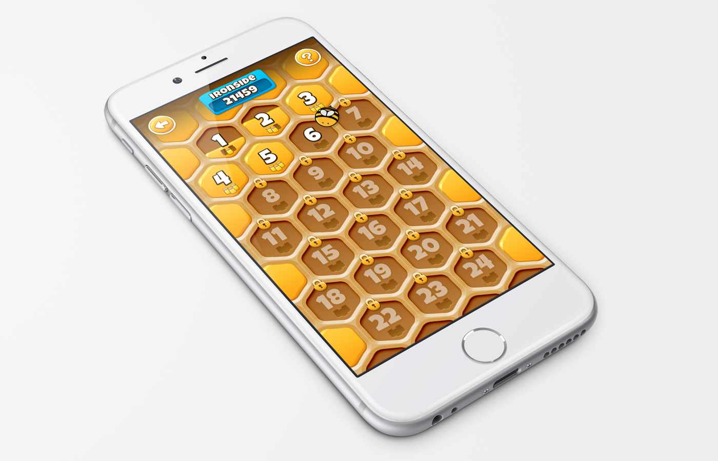
WordBurst is an adaptation of Scribble’s first release WordBuzz with a larger game board, more suited to devices with larger screens. The challenge of designing this new UI was just too irresistible to refuse!
Maintaining the garden theme from WordBuzz, inspiration from the Great British summer garden party served as the creative direction. This added a twist and sweet treats were created as obstacles in bursting the letters in this vibrant word game.
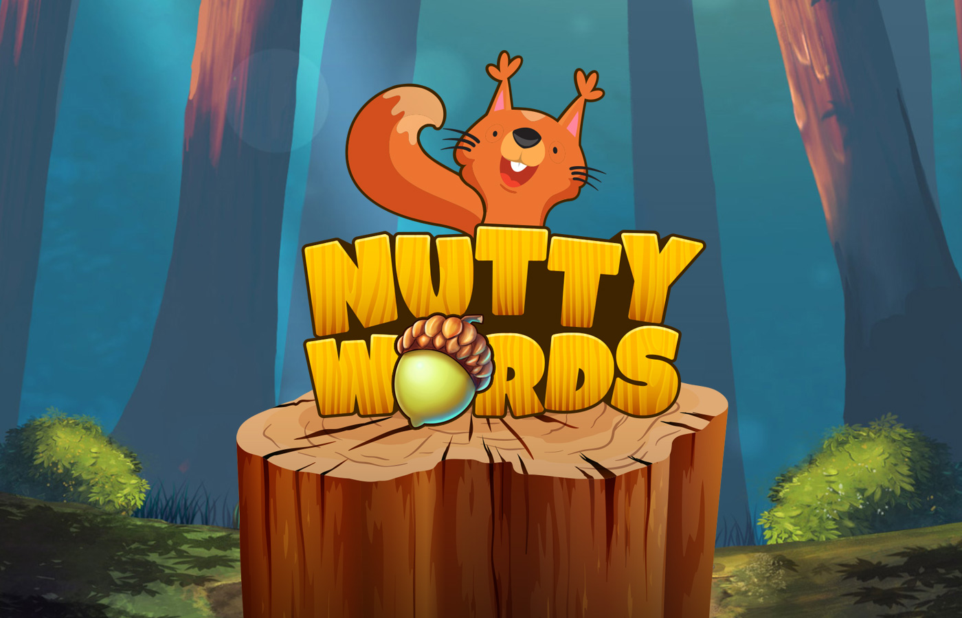
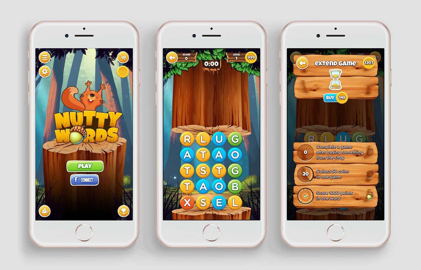
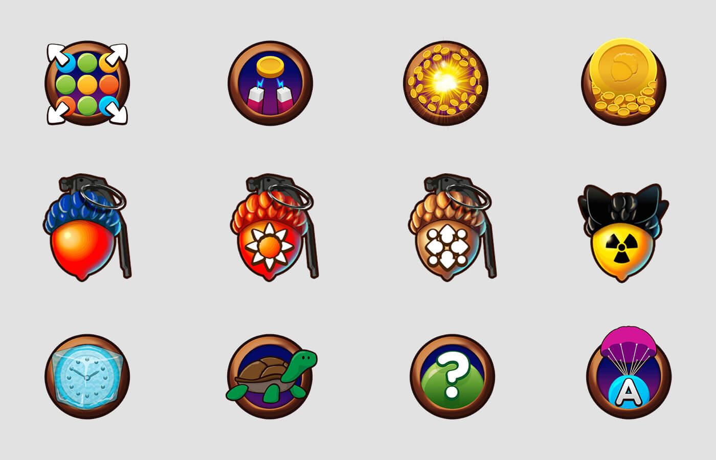
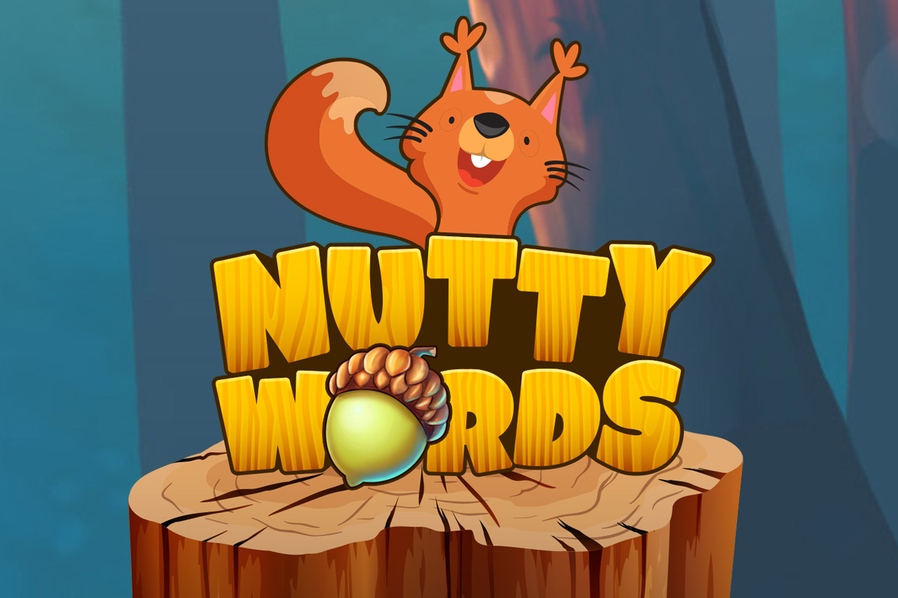
Having successfully launched their initial games, Scribble followed up with Nutty Words and another engaging game interface was required.
Scribble were keen to maintain a recognisable visual identity across all their titles so a forest theme was created for Nutty Words with a squirrel as the game mascot.

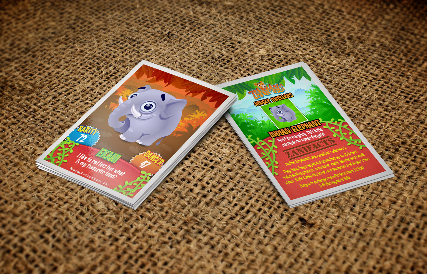

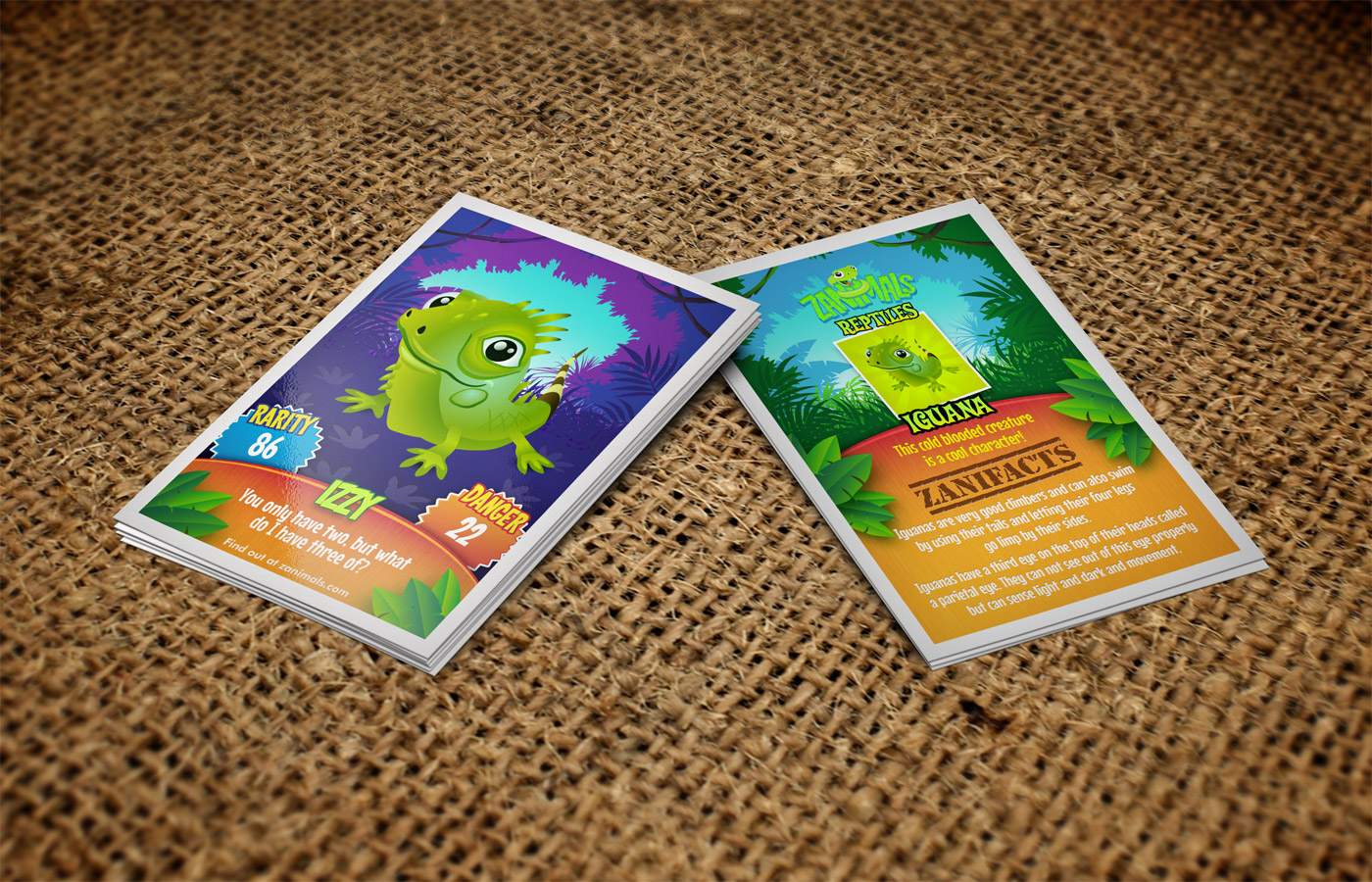

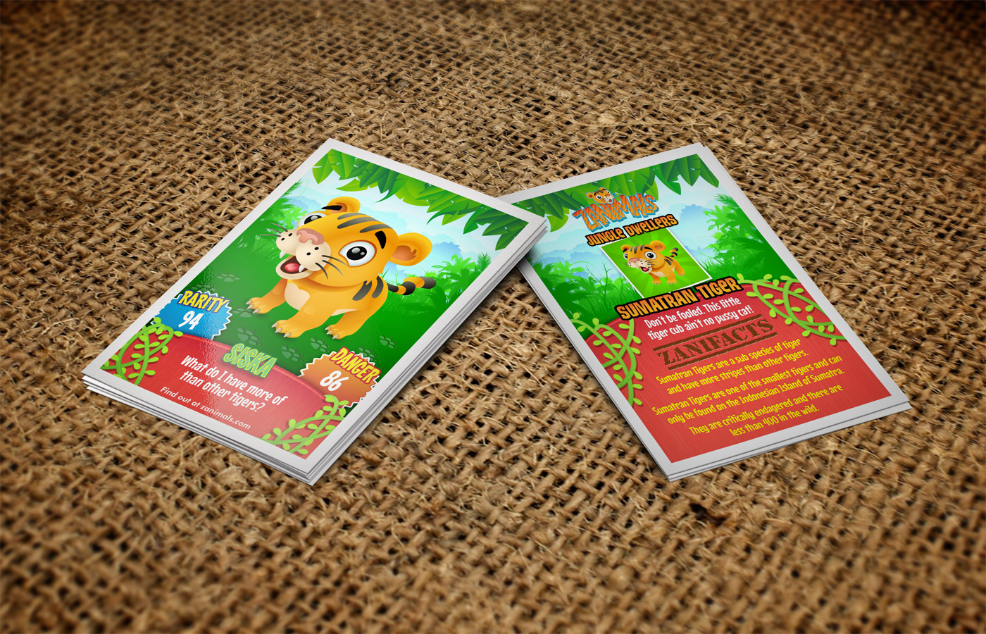
These lovingly designed collectible animal character cards help to introduce children to conservation and the natural world. Each card contains fun facts about the character and teaches kids about animals from different parts of the world.
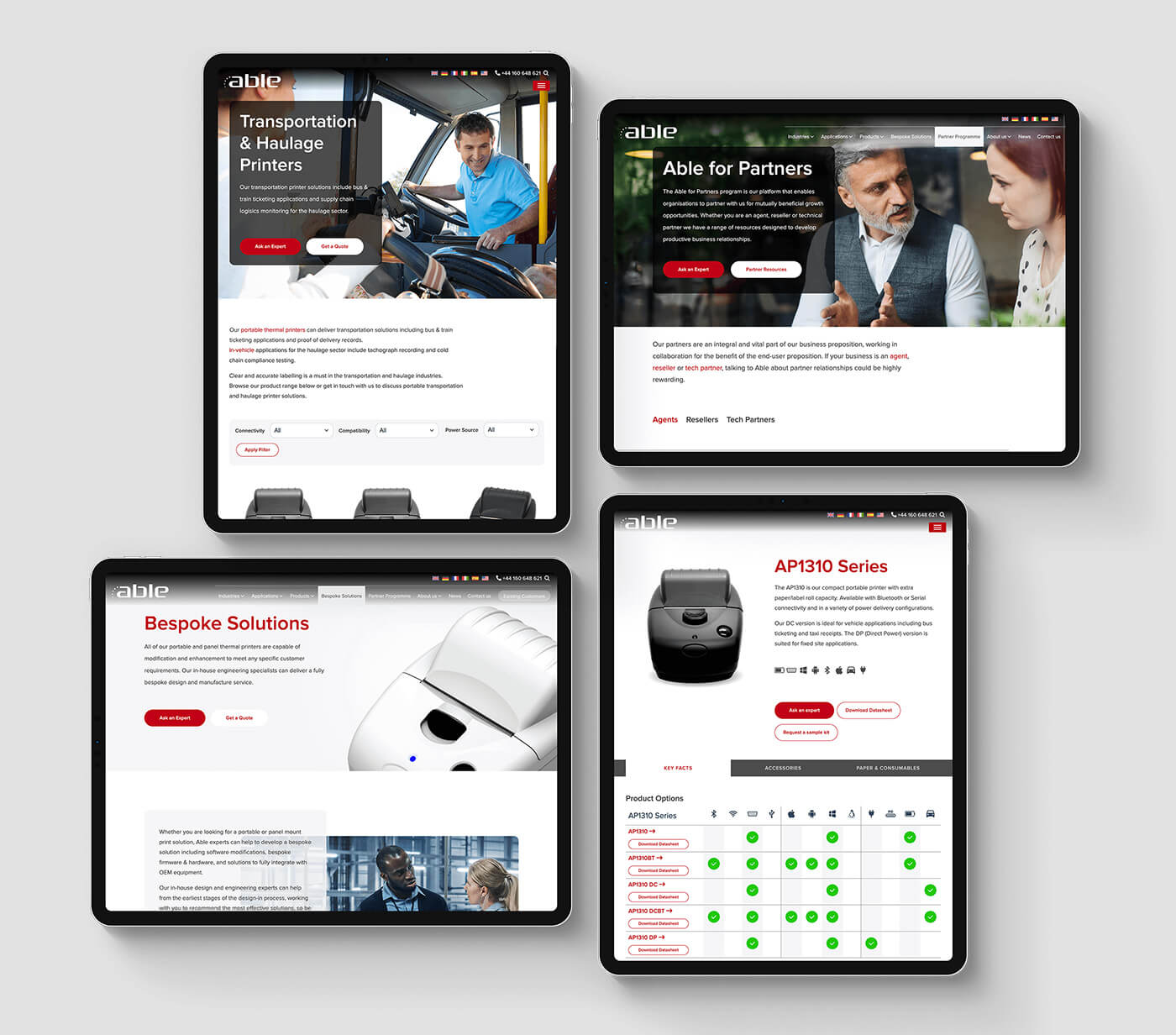
Able Systems leads the market in small printers and integrated solutions, catering to diverse industries and applications. With customers often searching for printers by industry or use case, a standard e-commerce approach simply wouldn’t cut it.
To solve this, we designed customer journeys through multiple iterations of lo-fi prototypes, creating pathways tailored to how users identify the right printer for their needs.
The result? A deceptively simple design that not only streamlines the user experience but also empowers Able’s team to effortlessly expand the site—adding new industries and applications while keeping navigation seamless.
view website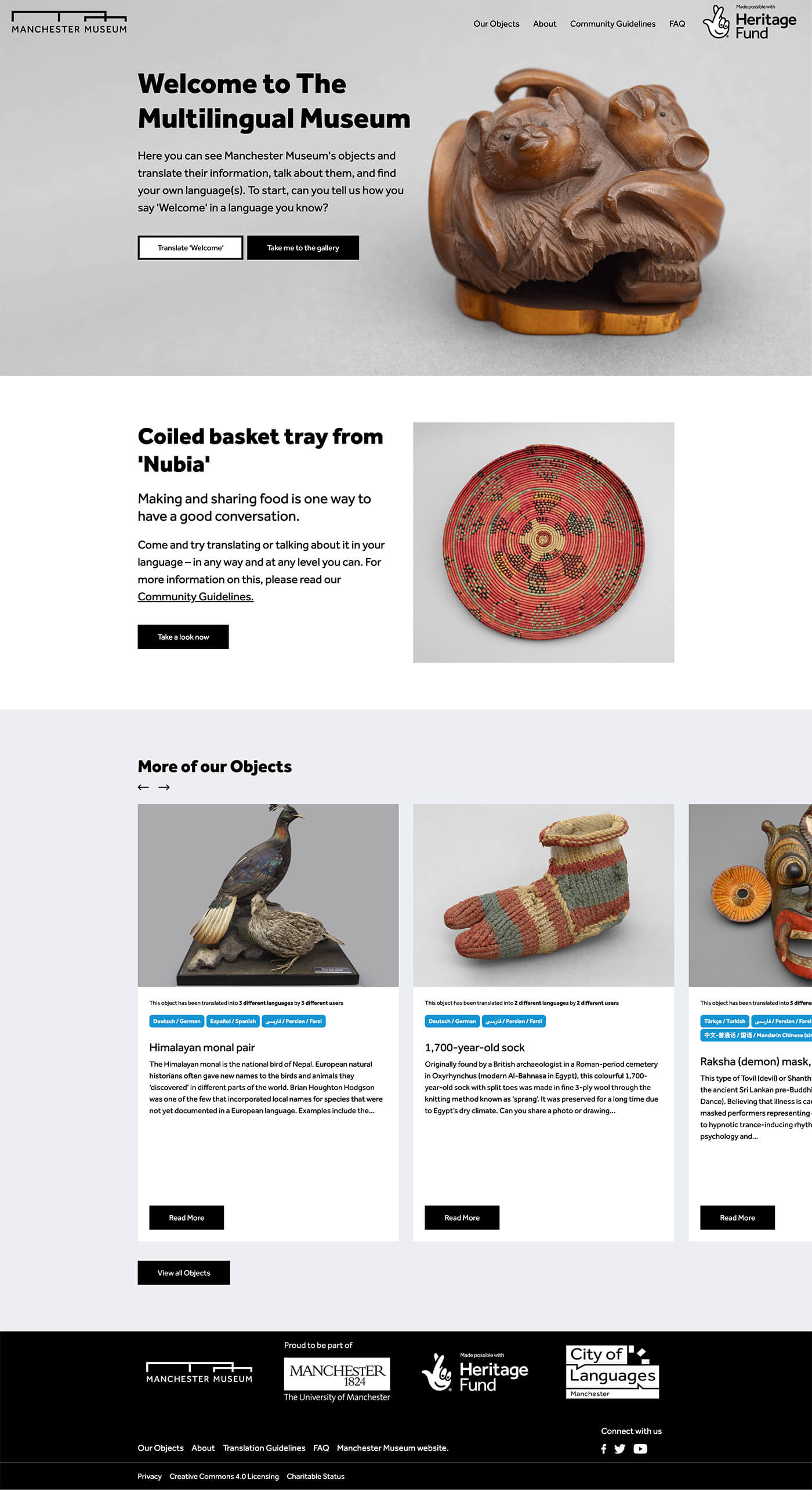
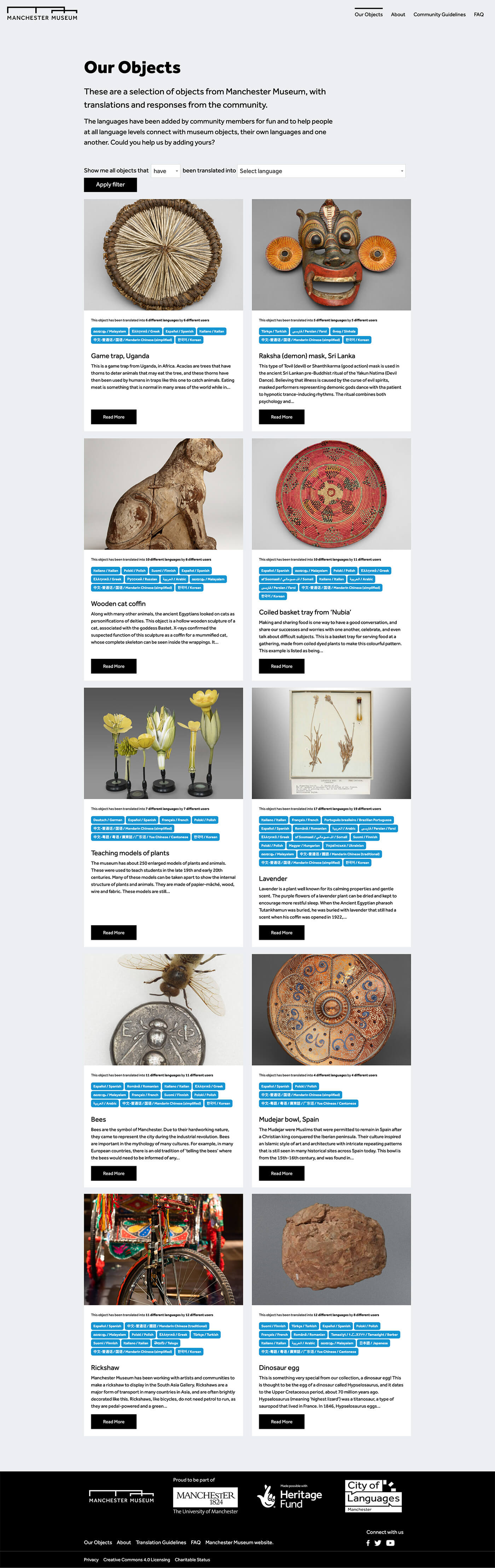
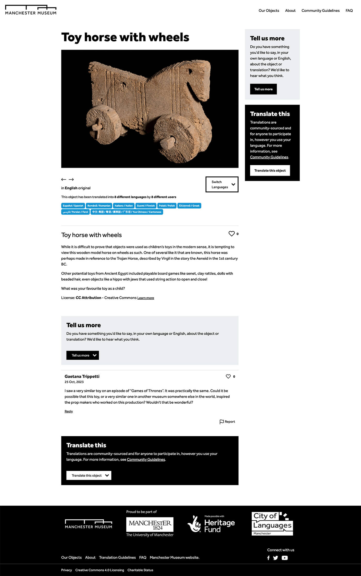
The Museum is an online platform where people can share their languages, whether they are native speakers, heritage speakers, or those learning.
The challenge was to craft a user-friendly interface that lets users explore object descriptions in multiple languages and contribute their own translations—written or spoken—with ease.
The solution was a clean, elegant design with intuitive labels and clear navigation that makes submitting content effortless. The result is a thriving Multilingual Museum community, with object descriptions now translated into a rich variety of languages, celebrating global diversity.
view website